During my time as digital design director at The Daily Orange, a chunk of my work was in data visualization. For these designs, I was given a headline, description of the story, and a set of data. I then would choose how best to display that data, making decisions such as the type of chart, color choice, and what information to highlight. I designed these graphics in adobe illustrator, and would make between 4-8 pieces per night.
Below are a few highlighted data visualizations I have created during my time there. Click the titles of the work to view the full story and graphic on The Daily Orange website.
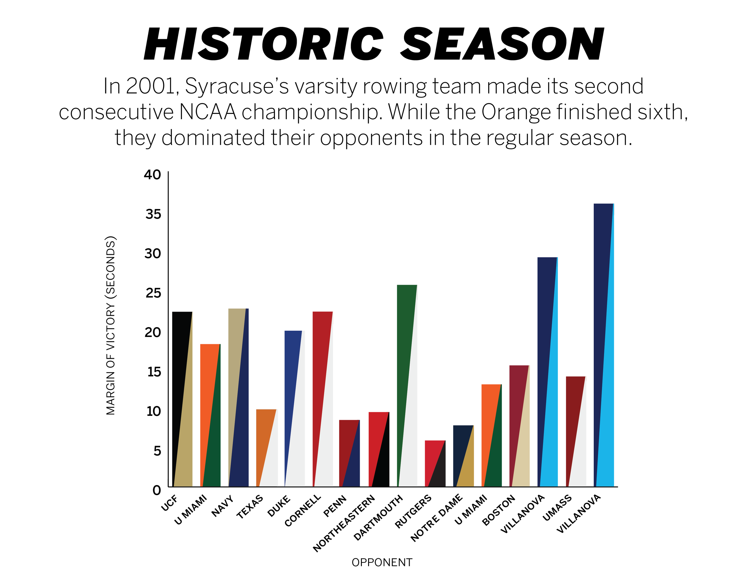
Story: 20 years later, SU’s 2001 varsity 8 remains the best in school history
This graph was created to represent Syracuse University’s rowing team’s margins of victory against their opponents during their season. Each bar in the graph has two colors, representing the school colors of each opponent.
Story: Daily Orange Lacrosse Guide 2021
This graph was created to show the variety in ages on the Canadian lacrosse team at the 2017 Women’s lacrosse world cup. It highlights sixteen year-old Bianca Chevarie as the youngest player on the team, represented by the grey dot.

Story: SU student voter turnout could alter mayoral election results
This chart was created to show the record-low percentages of voter turnouts during the 2021 primary election for mayor. The blue and red represent their respective political parties. I chose a donut chart for this graphic to show just how small the percentage was in voter turnouts.

You can browse more selections of my work below: