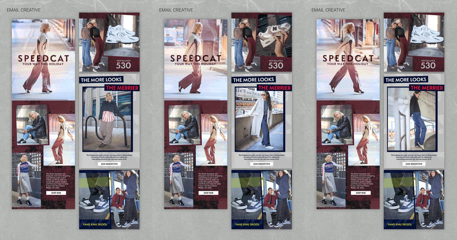
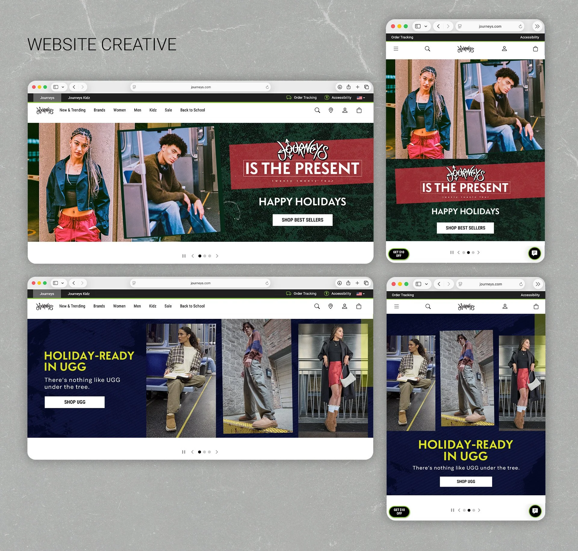
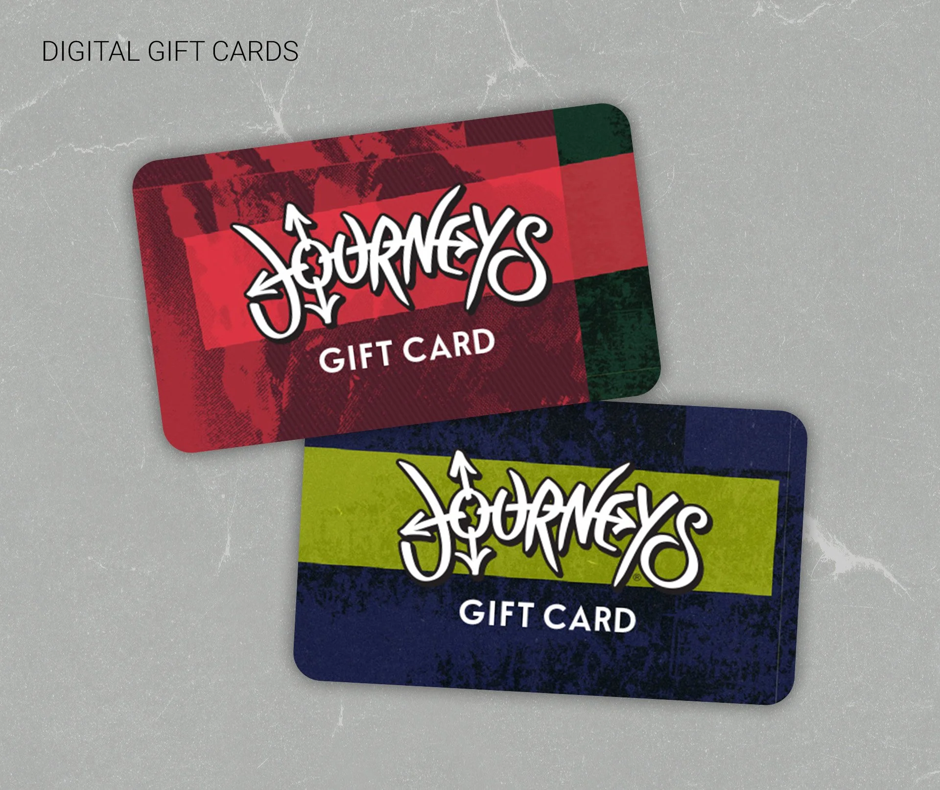
The Challenge: How do you incorporate a subtle, festive feel into a darker, grungier aesthetic?
For the Journeys Holiday 2024 campaign, we ditched the typical bright reds and ribbons for a moodier, more alternative approach. The seasonal art we got to play with provided maroons, navy blues, and dark greens along with grunge textures subtly reminiscent of cold mountains and clouds. It wasn’t all gloom though. Pops of bright yellow, grey, and red typography and gift-wrap style tape added the festive flair needed to draw in consumers for some good holiday shopping.